

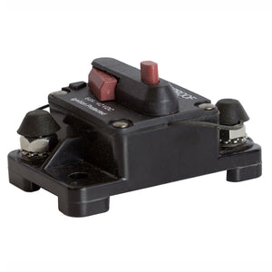
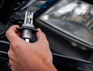
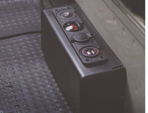
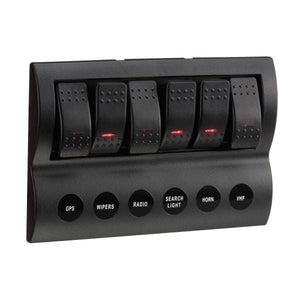


Tested tough. Adventure ready.
Getting power and lighting right matters, whether you’re wiring a trailer, upgrading your 4WD, or setting up for the next trip. KT makes electrical and lighting gear that’s built to handle real conditions, easy to install, and priced for everyday use. No overcomplication. Just gear that works.

A Sharper KT
KT has always been about practical, reliable gear.
Now we are making that clearer everywhere, on shelf, online, and across the full range.
A stronger look. A more consistent voice. One clear brand across everything we do.
Same KT at the core, just sharper.

The Brand Name
Always use the name KT in all communications, packaging, and product listings.
Keep it consistent. Keep it clear. Build recognition.

Logos
Use only approved KT logo files.
- Do not stretch, recolour, or alter the logo
- Use the primary logo wherever possible
- Use simplified marks only when space is limited
Consistency builds trust.

Clear space
Maintain clear space around the KT logo to protect visibility and impact.
- Clear space equals the cap height of the “K” in the logo
- No text, graphics, or edges should enter this space
- Always preserve clear space across all applications
This ensures the logo remains clean, legible, and recognisable at all times.

Colours
KT’s core palette is simple and strong:
- Black - strength and boldness
- White - clarity and space
- Pink - standout and recognition Use pink sparingly. Make it count
- Grey - for support only

Fonts
Berthold Akzidenz-Grotesk Primary font for headings and body text across all KT branded material.
Commercial license required for use.

Space Mono Used for technical content, specifications, and data display.
Open-source and available free via Google Fonts.